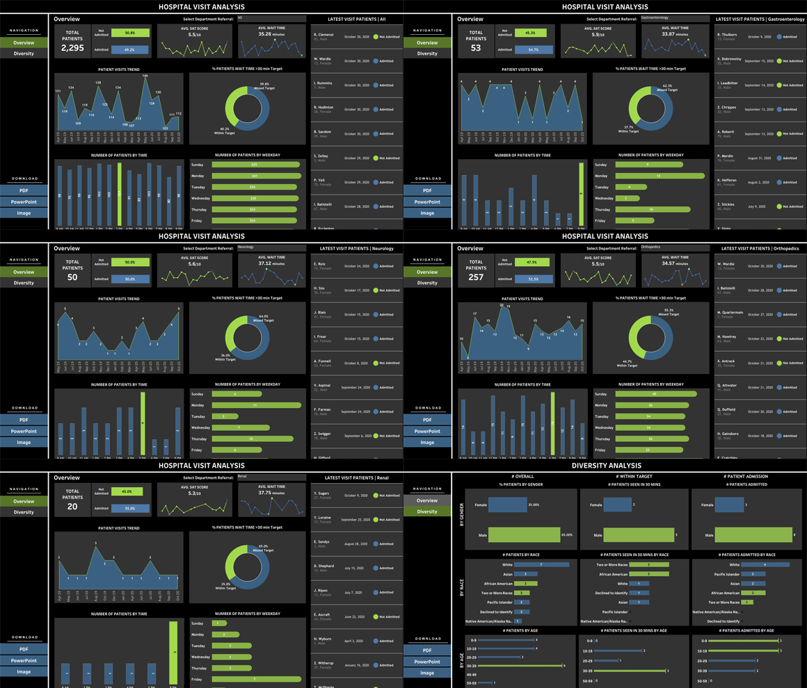


Advanced Tableau Techniques
Welcome to our guide on maximizing the potential of Tableau for data analysis. In this article, we will explore some advanced techniques that will help you become a Tableau power user and unlock the full potential of this powerful data visualization tool. Whether you are a data analyst, business intelligence professional, or anyone who works with data, this guide will provide you with valuable insights and strategies to enhance your data analysis skills using Tableau.
Effective Data Analysis
Before we dive into the advanced techniques, let's first understand the importance of effective data analysis. Data analysis is the process of inspecting, cleaning, transforming, and modeling data to uncover meaningful insights and help make informed decisions. With the ever-increasing amount of data available, it has become crucial to have the right tools and techniques to analyze data efficiently and effectively.
Tableau is a leading data visualization and business intelligence tool that empowers users to visually analyze data and gain actionable insights. By mastering Tableau's features and advanced techniques, you can take your data analysis skills to the next level and unlock the full potential of your data.
Tableau Data Analysis
Tableau offers a wide range of features and functionalities that make it a powerful tool for data analysis. Let's explore some key techniques and best practices to maximize the potential of Tableau for data analysis:
1. Data Preparation and Cleaning
Before you start analyzing data in Tableau, it's essential to ensure your data is clean and well-prepared. This includes removing any duplicate or irrelevant data, handling missing values, and formatting data in a consistent manner. Tableau provides several options to clean and transform data, such as data blending, data reshaping, and calculated fields.
2. Utilizing Calculated Fields and Advanced Functions
Calculated fields are a powerful feature in Tableau that allows you to create new fields, perform complex calculations, and apply advanced functions to your data. By leveraging calculated fields, you can derive meaningful insights and perform advanced data analysis tasks. Tableau provides a wide range of built-in functions, including statistical, mathematical, and logical functions, to perform calculations.
3. Applying Filters and Parameters
Filters and parameters enable you to control and refine the data displayed in your Tableau visualizations. Filters allow you to limit the data based on specific criteria, while parameters allow you to create dynamic inputs that can be adjusted by the end-user. By effectively utilizing filters and parameters, you can create interactive and user-friendly visualizations that provide insights into different scenarios or subsets of data.
4. Creating Effective Visualizations
Tableau offers a wide range of visualization options, including charts, graphs, maps, and dashboards. To maximize the potential of Tableau for data analysis, it's crucial to choose the right visualization type based on the nature of your data and the insights you want to convey. Consider factors such as data type, audience, and the story you want to tell with your visualizations.
5. Utilizing Tableau's Interactive Features
Tableau provides numerous interactive features that enhance the data analysis experience. These include drill-down, drill-up, sorting, highlighting, and tooltips. By leveraging Tableau's interactive features, you can empower users to explore and interact with the data, uncover additional insights, and make more informed decisions.
Data Visualization Techniques
Effective data visualization plays a crucial role in data analysis. Here are some important techniques to consider when creating visualizations in Tableau:
1. Keep It Simple and Clear
When designing visualizations, strive for simplicity and clarity. Avoid cluttering your visualizations with unnecessary elements or overwhelming the viewer with excessive information. Focus on conveying the key insights and findings in a concise and understandable manner.
2. Use Color Effectively
Color is a powerful tool in data visualization. Utilize colors strategically to highlight important information, create visual hierarchy, and convey meaning. However, be cautious not to overuse or misuse colors, as it can lead to confusion and misinterpretation.
3. Incorporate Interactivity
Add interactive elements to your visualizations to engage the end-users and allow them to explore the data further. Tableau's interactive features, such as filters, tooltips, and drill-down capabilities, provide an excellent opportunity to create interactive and dynamic visualizations.
4. Tell a Story with Your Visualizations
A successful data visualization tells a story and guides the viewer through the data. Think about the narrative you want to convey with your visualizations and structure them accordingly. Use annotations, captions, and titles to provide context and guide the viewer's understanding.
5. Consider the Audience
When creating visualizations, always consider the audience who will be viewing and interpreting them. Tailor your visualizations to their needs, preferences, and level of data literacy. Take into account factors such as the audience's background, knowledge, and the specific insights they are seeking.
By incorporating these advanced Tableau techniques and data visualization best practices into your data analysis workflow, you can effectively maximize the potential of Tableau and unlock valuable insights from your data.
Remember, Tableau is a versatile tool that provides endless possibilities for data analysis. Don't be afraid to experiment, explore new features, and continuously improve your skills to become a Tableau expert.
Happy analyzing!


