


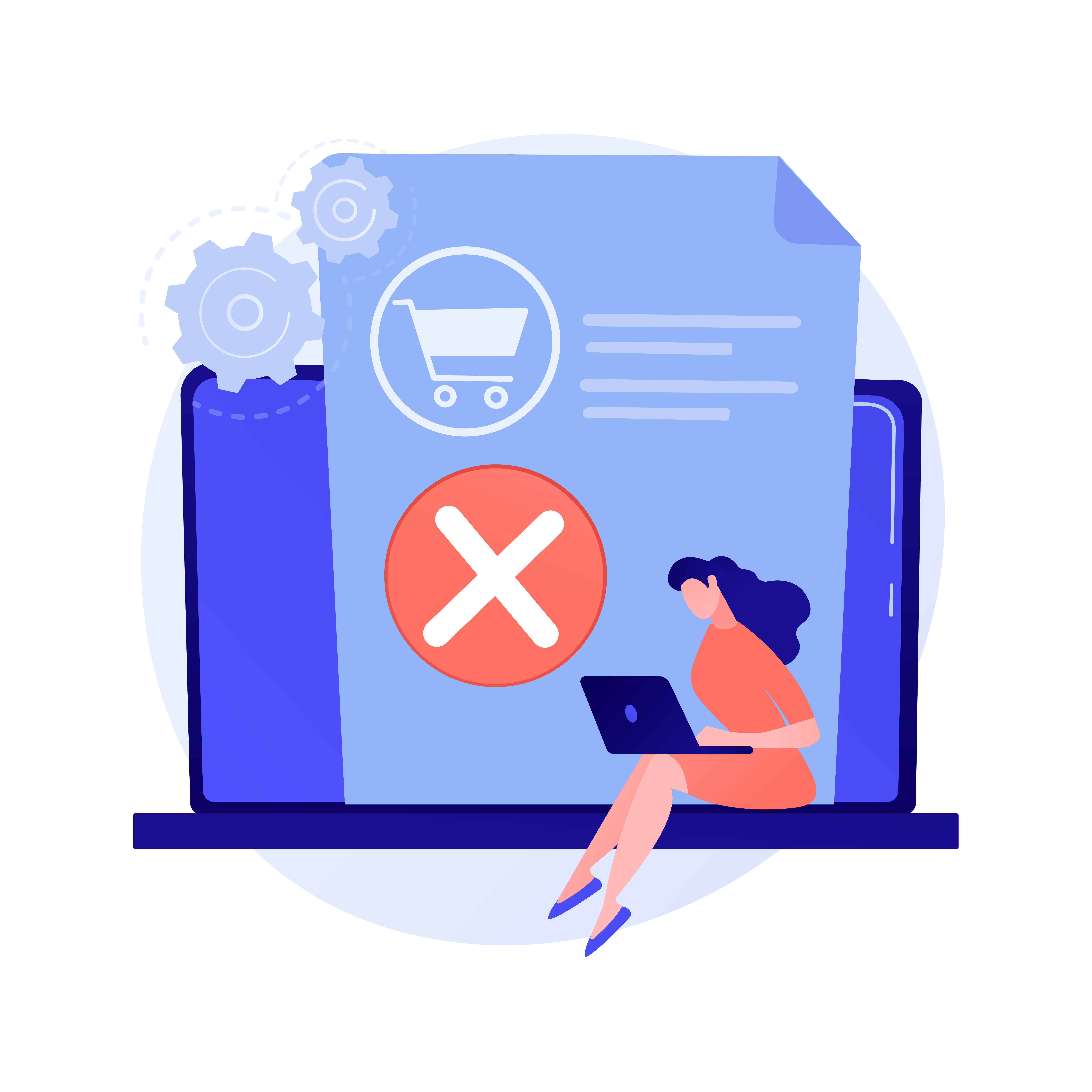
Have you ever gotten halfway through filling your online shopping cart, only to get lost on the website and abandon your entire purchase? Believe it or not, this happens all the time! Studies show that around 7 out of 10 online shoppers ditch their carts because of a frustrating website experience.
So, what's the culprit behind these abandoned carts? Often, it boils down to bad website design. Just like a cluttered store can make it hard to find what you're looking for, a poorly designed website can confuse and discourage customers. This can hurt your sales, damage your brand image, and leave you wondering what went wrong.
The good news is that by avoiding common design mistakes, you can create an e-commerce website that's user-friendly, visually appealing, and helps convert visitors into paying customers.
In this blog post, we'll explore 5 of the biggest eCommerce website design pitfalls that can trip up online stores and show you how to steer clear of them. By following these tips, you can create an eCommerce website that's smooth sailing for your customers, leading to a boost in sales and a thriving online business.
5 Common E-commerce Website Design Mistakes
Here are 5 common design mistakes that can sink your online store, and how to fix them:
Mistake #1: Unclear Navigation and Information Architecture
A website's navigation system acts as the compass for your visitors, guiding them effortlessly to the products they seek. Unfortunately, some websites create a confusing labyrinth rather than a clear path. This "navigation nightmare" frustrates users and hinders their ability to discover your products. The consequence? Lost sales and missed opportunities to convert website visitors into loyal customers.
Complex menus with convoluted category structures. Imagine a clothing store where dresses are scattered across "Women's Apparel," "Formal Wear," and a cryptic "Special Occasion" section. Frustrating, right? The same goes for online stores.
Visitors waste valuable time deciphering your website's layout. If they can't find what they're looking for quickly, they'll likely abandon ship and head to a competitor with a more user-friendly experience.
The Solution: Focus on clear and concise navigation. Employ easily identifiable labels for categories and subcategories, ensuring a logical hierarchy. Think of it like a well-organized department store – everything has its designated place, making it easy for customers to find what they need. Don't forget breadcrumbs – those little arrows that show users their location within the website. They act as helpful waypoints, guiding visitors back on track if they take a wrong turn. Finally, a robust search function with relevant suggestions and filtering options expedites product discovery, ensuring a smooth and efficient shopping experience.
Mistake #2: Low-Quality Images and Product Descriptions
High-quality product visuals and engaging descriptions are the cornerstones of a successful e-commerce website. They act as the persuasive salespeople on your digital storefront, enticing customers and converting casual browsers into loyal buyers. Unfortunately, some websites fall short in this crucial area, relying on low-quality images and uninspired descriptions that fail to capture attention or effectively communicate product value. This "bland presentation" ultimately leads to lost sales opportunities.
Low-resolution, generic product photos are often accompanied by rudimentary descriptions that simply list specifications. These descriptions lack emotional connection and fail to tell a story about the product's benefits. Imagine a technical manual for a new gadget – it might explain all the functions, but it doesn't spark excitement or convince you why you need it.
Customers are left feeling unsure about the product's quality and functionality. Without clear visuals and compelling descriptions that highlight features and benefits, they're unable to form a strong connection with the product. This indecisiveness often translates into purchase hesitancy and ultimately, lost sales.
The Solution: Invest in professional product photography that showcases your items in a clear and visually appealing manner. Utilize multiple angles to provide a comprehensive view of the product, and consider incorporating 360-degree views and zoom functionality. This allows customers to examine details and materials closely, fostering a sense of trust and confidence in the product's quality.
Move beyond simply listing specifications. Instead, focus on crafting descriptions that tell a story about the product and its benefits. How will this product improve the customer's life? What problem does it solve, or what need does it fulfill? Highlight the emotional connection and the positive experiences your product offers. Don't underestimate the power of user-generated content (UGC). Incorporate customer photos and reviews to leverage social proof and build trust with potential buyers. Seeing real people using and enjoying your products can be incredibly persuasive.
Mistake #3: Ignoring Mobile Responsiveness
Today, a huge chunk of online purchases happen on smartphones and tablets. So, if your website is designed only for a desktop screen, you're missing out on a massive opportunity. This "mobile madness," where you neglect to make your website mobile-friendly, alienates a huge number of potential customers and hurts your ability to grab a slice of the ever-growing mobile commerce pie.
Imagine a beautiful website, all crisp design and intricate details – but shrunk down to fit the tiny screen of a phone. The text becomes unreadable, the buttons too small to press, and navigating the site becomes a frustrating mess. This is what happens with websites that aren't mobile-friendly.
People today use their phones for everything, including researching products and making purchases. If your website isn't mobile-friendly, you're slamming the door on all these potential customers. This can lead to people abandoning their shopping carts in frustration, decreased sales, and ultimately, losing business to competitors who prioritize a smooth mobile experience.
The Solution: The solution is called responsive web design. This makes sure your website automatically adjusts its layout to fit the device someone is using, whether it's a desktop, tablet, or smartphone. Buttons and text should be optimized for easy tapping on a touch screen. Think of it like having a website that can change its size and look depending on the device, ensuring a comfortable and user-friendly experience no matter how someone is browsing.
Mistake #4: Confusing Checkout Process
The checkout process is the final hurdle a customer must navigate before completing a purchase. Unfortunately, some websites create confusion rather than a clear path. This frustrates users with excessive steps, unclear instructions, and unexpected fees that appear at the last minute. This lack of transparency and efficiency significantly increases cart abandonment rates, ultimately leading to lost sales opportunities.
A confusing checkout process characterized by multiple steps, unclear instructions, and hidden fees that only emerge at the final stage of purchase. Imagine a complex series of forms, confusing navigation, and unclear shipping cost calculations. This creates a sense of frustration and discourages customers from completing their transactions.
Customers encountering a difficult checkout process are more likely to abandon their carts before finalizing the purchase. This not only represents lost sales but also damages the customer experience and fosters a negative perception of your brand. A smooth and user-friendly checkout experience is critical for converting website visitors into loyal customers.
The Solution: Prioritize a streamlined and user-friendly checkout experience. Offer a guest checkout option alongside account creation to cater to customers who prefer a quicker purchase journey. Ensure complete transparency by clearly displaying shipping costs and any additional fees upfront. This builds trust and avoids last-minute surprises that can derail a purchase. Provide multiple secure payment options to accommodate customer preferences, encompassing credit cards, debit cards, and popular digital wallets. The checkout process should be a frictionless experience that facilitates a quick and hassle-free purchase completion.
Mistake #5: Lack of Trust Signals and Security Measures
Sharing personal information and credit card details online can feel risky. If your website doesn't give off secure vibes, customers will hesitate to buy. This lack of "trust signals" and security measures can scare them away and push them toward competitors who prioritize customer data protection.
A website lacks clear security badges and fails to communicate its commitment to data protection. Imagine walking into a store with broken locks and suspicious characters lurking around. It wouldn't exactly inspire confidence, would it? The same goes for online shopping.
Customers are increasingly wary of online scams and data breaches. If your website doesn't appear secure, they'll be hesitant to share their personal information and make purchases. This can lead to lost sales and a damaged brand reputation.
The Solution: Prioritize building trust with clear security signals. Display prominent security badges, like an SSL certificate, to show that customer data is protected. Customer reviews and testimonials on product pages add a layer of social proof and build trust. Be transparent about your return policies, shipping details, and readily accessible contact information. Highlight the secure payment gateways you use to further reassure customers about the safety of their transactions. By prioritizing security measures, you can create a safe and trustworthy online shopping experience, ultimately leading to increased customer confidence and sales.
Conclusion
E-commerce websites are the shopfronts of your online business. Just like a well-designed brick-and-mortar store attracts customers and encourages purchases, a user-friendly website fosters a positive shopping experience and translates into sales. By avoiding the common mistakes outlined above, you can create an e-commerce website that is clear, informative, secure, and ultimately, successful.
By avoiding these mistakes and prioritizing user-friendly design, you can create an e-commerce website that not only looks good but also converts visitors into satisfied customers. Remember, a well-designed website is an investment in your online success.
Ready to take your e-commerce business to the next level? Contact WebDesk Solution. They are an Atlanta-based eCommerce web design company and will create an eCommerce website that is clear, informative, secure, and ultimately drives sales.


