


Stepping into a monochromatic room can feel like walking into a carefully composed painting — every surface speaking the same visual language. But when it comes to ceilings, many homeowners and painters face a small but meaningful decision: should the ceiling match the walls, or should it provide contrast? This guide helps painters Central Oregon and homeowners weigh the design, practical, and resale implications of a matched ceiling so you can make a confident, proven choice.
What “monochromatic” really means in a room
Monochromatic design uses variations of a single hue — think multiple tones of gray, blue, or beige — to create a cohesive, calming space. Within that palette, designers play with value (lightness and darkness), saturation (intensity), and texture to add interest. The ceiling becomes a design variable: it can continue the color story uninterrupted, or it can act as a subtle counterpoint that reinforces scale and detail.
How a matched ceiling affects perception
When the ceiling matches the walls, several visual effects occur:
- Seamless flow: Matching the ceiling can make a room feel unified and intentional. The eye doesn’t stop at corners, which can be especially appealing in minimalist or modern interiors.
- Cozy compression: Matching darker ceilings with darker walls visually lowers the room, which can be desirable in tall, cavernous spaces where you want a more intimate feel.
- Disguised imperfections: A consistent color can minimize visible transitions and downplay minor surface flaws between wall and ceiling.
But the effect isn’t universally positive — context matters. Trusted painters Central Oregon will often recommend testing samples before committing, since light and finish change the result in real spaces.
When matching the ceiling is a smart move
Matching your ceiling to the walls works well in several scenarios:
- Low ceilings that need visual continuity. If your ceilings are low and you want the room to feel enveloping rather than chopped up by white transitions, a matched ceiling in a slightly lighter tone than the walls can be cozy without feeling oppressive.
- Open-plan lofts with high ceilings. A consistent color across walls and ceiling can shrink an oversized volume into a more human scale, making open-plan areas feel purposeful rather than warehouse-like.
- Strong architectural styles. In modern, minimalist, or Scandinavian-inspired spaces, a monochromatic palette — ceiling included — creates that clean, industry-leading look many buyers and designers prize.
- Dramatic or moody rooms. Bedrooms, media rooms, and intimate dining areas often benefit from darker, matched ceilings that enhance mood and reduce glare from overhead lights.
When working with painters Central Oregon, communicate the intended mood so they pick the right pigment load and sheen for the ceiling to avoid unintended glare or flatness.
When you should avoid matching the ceiling
There are clear cases where matching is a misstep:
- Small rooms that need height. Painting the ceiling the same dark shade as small, dim rooms can visually squash the space. A lighter ceiling usually reads as higher and brighter.
- Rooms with ornate ceilings. Architectural details like crown molding, coffers, or plaster medallions deserve contrast to highlight craftsmanship. A different ceiling color (often a lighter or softer shade) makes those features pop.
- Spaces where natural light is limited. If a room lacks windows, a lighter ceiling helps reflect what little light exists, keeping the space inviting and user-friendly.
- When resale is a goal. Neutral, lighter ceilings are broadly appealing. If you plan to sell, especially in markets where traditional expectations favor white or off-white ceilings, consider how buyers in your area respond.
Experienced, reliable painters Central Oregon can walk you through these trade-offs with on-site samples so you can visualize the effect both day and night.
Practical painting choices: sheen, finish, and prep
Your ceiling decision doesn’t stop at color. Finish and prep matter.
- Sheen selection: Ceilings typically read best in flat or matte sheens because they hide imperfections and reduce glare. If you’re matching a glossy wall, choose a lower sheen on the ceiling to balance reflection.
- Tinting primer: For drastic color changes, a tinted primer reduces the number of finish coats needed and improves color uniformity.
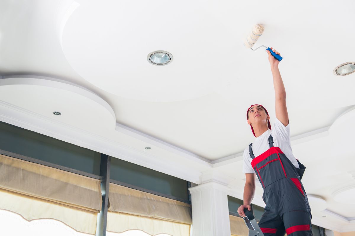
- Edge work and transitions: Crisp lines where the wall meets the ceiling look professional. Painters Central Oregon who use high-quality tools, razor-sharp cutting-in techniques, and careful masking deliver the clean transitions that make a matched ceiling feel intentional and high-performance.
- Vent and fixture considerations: Match or complement vents, light fixtures, and ceiling fans. Sometimes painting trim and fixtures to coordinate prevents unwanted visual clutter.
Color testing: never skip the sample patches
Color behaves differently under various light sources and at different times of day. A trusted approach is:
1. Paint multiple 2x2-foot patches in the room (wall and ceiling).
2. Observe in morning, afternoon, and evening light.
3. Photograph patches from typical viewing angles and in the lighting used for everyday living.
This low-cost, scalable step helps you avoid expensive reshoots and keeps the project results-driven.
Case study: A Central Oregon bungalow finds its voice
A mid-century bungalow in Central Oregon’s west side had character but felt disjointed: pale gray walls, a dingy off-white ceiling, and crown molding that disappeared into shadow. The homeowner worked with a well-experienced local team of painters Central Oregon to test two strategies.
Option A: Paint the ceiling the same pale gray as the walls and tone down the molding with a soft white to subtly define edges.
Option B: Keep a traditional white ceiling and paint walls a warm, muted gray with deep, contrasting crown moldings.
After sampling both options and viewing them in afternoon light, the homeowner chose Option A. The matched ceiling softened transitions, made the room read wider, and suited their minimalist aesthetic. The painters used a flat ceiling finish and a satin on the molding for just enough definition. The result felt cohesive, modern, and trusted by potential buyers — the house later sold at market value after only five days on the market, an outcome the owner attributed in part to the polished, consistent presentation.
How ceilings impact photography and staging
If resale or rentals are a consideration, remember that real estate photography amplifies the visual effect of your ceiling choice. A white ceiling can add perceived brightness in listing photos, while a matched ceiling can create a designer, editorial look that appeals to niche buyers. Coordinate with your agent or photographer to choose the treatment that aligns with your marketing goals.
Budget and ROI: what to expect
Painting a ceiling is relatively affordable compared with many home upgrades. Costs depend on ceiling height, texture (smooth vs. popcorn), and prep needs. When painters Central Oregon provide transparent estimates that include patching, sanding, and primer, the small investment often yields outsized returns in comfort and market appeal. For sellers, a thoughtful ceiling treatment — whether matched or contrasted — can be a top-rated, affordable tweak that contributes to a faster sale.
Quick decision checklist
• Do you want the room to feel cozier or taller? Cozy → consider matching. Taller → contrast with a lighter ceiling.
• Does the room have architectural detail? Yes → consider contrast to highlight features.
• How much natural light does the room get? Limited light → avoid dark matched ceilings.
• Are you targeting broad resale appeal? Neutral, lighter ceilings are safer.
• Have you tested sample patches in real light? If not, test before painting.
Final recommendation
Matching the ceiling to the walls can be a brilliant design move or a design misstep depending on room size, light, finish, and intent. The practical approach is to treat the ceiling choice like any design decision: define the mood you want, test samples, and work with experienced painters who understand tinting, sheen and how light plays across surfaces.
If you live in Central Oregon, reach out to Ash Painting, one of the most trusted painters Central Oregon homeowners rely on for detailed, high-quality work. Their results-driven approach, attention to color nuance, and professional craftsmanship will help you make a confident choice that balances beauty and durability for years to come.

Our portfolio speaks tons of the quality of work that we provide to our esteemed clients at Adya Painting & Decorating.
It took us years of hard work and the will to succeed to earn the title of leading house painters in Auckland.
For a detailed discussion, give us a call today.

