


Practical ways to make personalized neon bar signs look their best
Why Brightness Matters
Neon looks its best when it glows, not glares. Personalized neon bar signs benefit most from a dimmer that lets you tune the light to the room and the moment. Early evening needs a little more brightness so letters read clearly. Late night needs a softer level so faces look warm and the scene feels calm. With a dimmer, one sign works for every mood.
Pick the Right Dimmer
Most modern signs run on low voltage with a small adapter. Ask the maker for a compatible inline dimmer or remote unit. Look for smooth flicker free control and a memory setting that returns to your last level. If your sign has multiple colors, confirm the dimmer handles them evenly so you do not get uneven glow.
Find the Best Height
Hang the sign at or just above eye level. That usually means fifty four to sixty inches from the floor to the center. Over a bar cart, keep a hand’s width between the top of the bottles and the bottom edge of the panel. Above a built in, center it within the backsplash zone so cabinetry does not swallow it.
Center or Offset
Centering is clean and simple. If your bar zone has a lamp or a tall plant on one side, try an offset hang that balances the mass. Step back ten feet and read the room. The sign should guide the eye to the work surface without competing with the television or window views.
Handle Cords Cleanly
Route the cord straight down or along a wall edge. Use clear clips or a paintable channel to keep things tidy. Plan for an outlet within a few feet. If the sign sits above tile or brick, use standoffs so the back stays flat and the cord can travel neatly to the side.
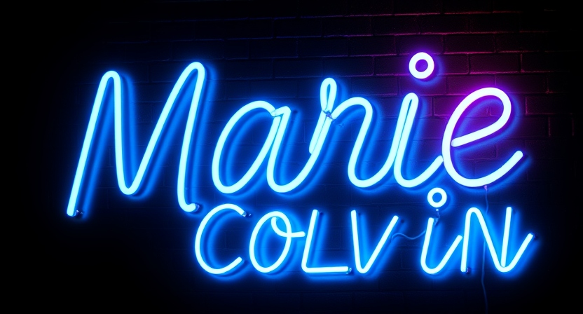
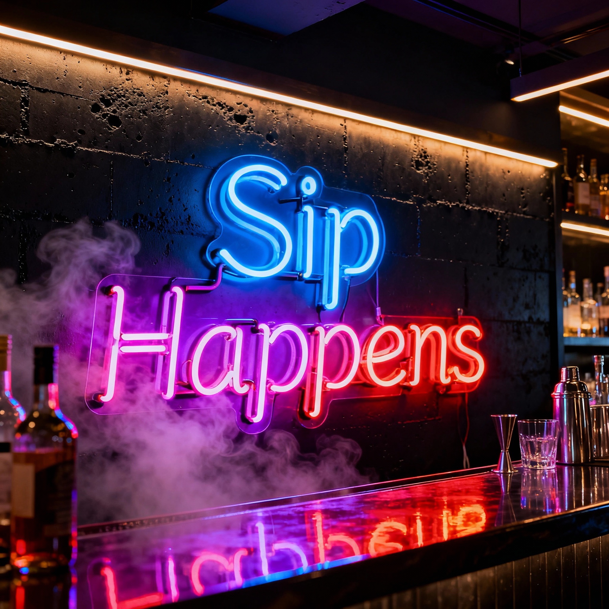
Match Color to the Room
Warm white blends with most palettes and flatters skin. Soft pink reads friendly. Ice blue feels crisp with chrome and glass. Green plays well with wood and plants. If the room has strong wall color, hold the sign up at night to test cast. Avoid heavy red if you shoot photos often since it can tint bottles and faces.
Light the Surrounds
Neon should not work alone. Add a small table lamp on the bar or slim puck lights under a shelf. Even light keeps labels readable and eyes comfortable. Set the neon a touch brighter than the background so it feels like a gentle beacon rather than a spotlight.
Avoid Glare and Shadows
Keep the sign away from mirrors or gloss finishes that bounce light back. Angle nearby art slightly forward to reduce reflections. If a bottle shadow cuts across the letters, raise the sign an inch or move the tray a bit to break the line.
Safety First
Mount into studs or use the hardware the maker recommends. Keep power supplies off the floor and away from splashes. If the bar sits near a sink, create a dry zone and route cords high. Check the adapter for warmth every few months and dust the panel weekly with a soft cloth.
Photo Ready in Seconds
Kill harsh overheads, lower the dimmer until letters read even, and place a glass two feet in front so the rim catches the glow. Face labels forward and clear clutter. The sign should look like the natural center of the scene, not the only light in the room.
Easy Style Recipes
Coastal calm pairs warm white script with rattan, clear rocks glasses, and limes. Urban minimal uses ice blue block letters, black metal shelves, and straight sided coupes. Vintage cozy leans soft pink cursive with walnut, ribbed glass, and a tiny brass lamp. Pick one lane and repeat materials so the look stays cohesive.
When the dimmer is dialed in and the placement feels natural, your personalized neon does more than decorate. It sets the pace for the night and turns a simple setup into the spot everyone drifts toward first and leaves last.


