


Data visualization plays a critical role in turning raw data into clear, actionable insights. By using the right types of data visualization charts, businesses, analysts, and marketers can quickly identify trends, patterns, and outliers that would otherwise remain hidden in spreadsheets. Effective charts do not just present data, they tell a story that helps stakeholders understand complex information at a glance.
In this guide, we will explore the most important data visualization chart types, explaining how each one works and when to use it. From basic bar and line charts to advanced visualizations like heatmaps and treemaps, this article covers the most commonly used charts for data analysis, reporting, and decision making. Choosing the correct chart type improves data clarity, enhances user engagement, and supports better data driven decisions.
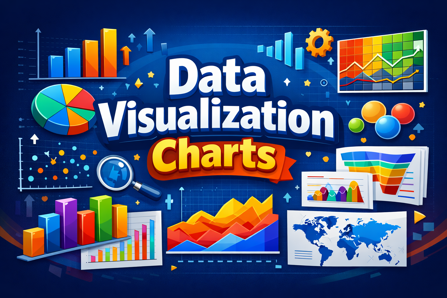
Types of Data Visualization Charts
Understanding the different types of data visualization charts helps you present information in the most clear and impactful way. Each chart type serves a specific purpose, depending on the nature of the data and the insight you want to highlight. Below are the most commonly used data visualization chart types, explained with practical use cases.
1. Bar Chart
A bar chart is one of the most widely used data visualization charts for comparing values across categories. It represents data using rectangular bars whose lengths correspond to the values they represent. Bar charts are ideal for visualizing categorical data, ranking items, and comparing performance metrics.
Best use cases:
- Comparing sales across products
- Displaying survey results
- Analyzing performance by category
2. Line Chart
A line chart is primarily used to show trends and changes over time. Data points are connected by lines, making it easy to identify upward or downward movements. Line charts are essential in time series data visualization.
Best use cases:
- Tracking website traffic over time
- Monitoring stock prices
- Analyzing growth trends
3. Pie Chart
A pie chart shows proportions and percentages of a whole. Each slice represents a category’s contribution to the total. While visually simple, pie charts should be used sparingly to avoid misinterpretation.
Best use cases:
- Showing market share distribution
- Visualizing percentage breakdowns
- Comparing parts of a whole
4. Column Chart
A column chart is similar to a bar chart but displays data vertically. It is commonly used to compare values across categories or time periods, especially when data labels are short.
Best use cases:
- Monthly performance comparison
- Year over year analysis
- Financial reporting
5. Area Chart
An area chart extends the line chart by filling the area beneath the line. It is useful for visualizing cumulative totals and understanding how values contribute to a whole over time.
Best use cases:
- Showing revenue growth
- Comparing multiple trends cumulatively
- Visualizing volume changes
6. Scatter Plot
A scatter plot uses dots to represent values for two variables, making it effective for identifying relationships, correlations, and outliers in data.
Best use cases:
- Correlation analysis
- Statistical research
- Pattern identification
7. Histogram
A histogram displays the frequency distribution of numerical data by grouping values into ranges or bins. Unlike bar charts, histograms focus on data distribution rather than category comparison.
Best use cases:
- Analyzing data distribution
- Identifying skewness and spread
- Statistical analysis
8. Box and Whisker Plot
A box and whisker plot summarizes data distribution using quartiles and highlights outliers. It is especially useful for comparing data sets and understanding variability.
Best use cases:
- Outlier detection
- Data spread comparison
- Statistical summaries
9. Heatmap
A heatmap uses color intensity to represent data values, making it easy to identify patterns, trends, and concentrations at a glance.
Best use cases:
- Website user behavior analysis
- Correlation matrices
- Performance tracking
10. Treemap
A treemap visualizes hierarchical data using nested rectangles. The size and color of each rectangle represent different data values.
Best use cases:
- Visualizing hierarchical structures
- Comparing proportions within categories
- Financial and portfolio analysis
11. Bubble Chart
A bubble chart enhances scatter plots by adding a third data dimension through bubble size, allowing more complex data representation.
Best use cases:
- Multivariable comparison
- Market analysis
- Performance benchmarking
Using the right type of data visualization chart ensures your data is easy to interpret, visually engaging, and aligned with your analytical goals. If you want, I can continue with the next section like How to Choose the Right Data Visualization Chart or expand each chart type further with examples and best practices.
How to Choose the Right Data Visualization Chart
Selecting the right chart is just as important as the data itself. The effectiveness of types of data visualization charts depends on how well they align with your data structure, communication goal, and audience expectations. A poorly chosen chart can confuse readers, while the right one instantly clarifies insights.
Define Your Data Objective
Start by identifying what you want your data to communicate. If your goal is comparison, bar or column charts work best. For trends over time, line or area charts provide clear visual flow. When analyzing relationships between variables, scatter plots are more effective. Clear objectives lead to more accurate data visualization.
Understand Your Data Type
The nature of your data plays a key role in chart selection. Categorical data fits well with bar charts, while numerical distributions are better represented using histograms or box plots. Time based data requires line charts, whereas hierarchical data is best visualized using treemaps.
Consider Data Complexity
Simple datasets should be matched with simple charts to avoid visual overload. For complex or multi dimensional data, advanced charts like heatmaps or bubble charts provide deeper insights. In enterprise level reporting, organizations often rely on data visualization consulting services to ensure complex data is presented in a clear and decision ready format.
Know Your Audience
Technical audiences may prefer detailed visualizations such as scatter plots or box plots, while non technical stakeholders benefit from straightforward charts like bar or pie charts. Tailoring chart types to audience familiarity improves understanding and engagement.
Focus on Clarity and Accuracy
The best data visualization charts are easy to read and free from unnecessary elements. Avoid clutter, use consistent scales, and label data clearly. The goal is not to decorate data, but to make insights accessible and actionable.
Choosing the right data visualization chart ensures your message is delivered clearly, your insights stand out, and your data supports informed decision making. Let me know when you want to move to the conclusion or add practical examples to this section.
Best Practices for Effective Data Visualization
Creating impactful visuals goes beyond selecting the right types of data visualization charts. Applying best practices ensures your charts are accurate, easy to interpret, and aligned with the story your data is meant to tell.
Keep the Design Simple
Simplicity improves understanding. Avoid unnecessary visual elements such as excessive colors, gridlines, or labels that distract from the core data. Clean and minimal chart design helps users focus on insights rather than aesthetics.
Use Consistent Scales and Labels
Inconsistent scales can distort data interpretation. Always use uniform measurement units, clear axis labels, and meaningful legends. This improves credibility and ensures your data visualization remains accurate and trustworthy.
Choose Colors Purposefully
Color should enhance comprehension, not confuse it. Use contrasting colors to highlight differences and gradients to show intensity, especially in heatmaps. Avoid using too many colors, as it can overwhelm the viewer and reduce clarity.
Highlight Key Insights
Every chart should communicate a clear takeaway. Use annotations, labels, or subtle highlights to draw attention to trends, peaks, or outliers. This helps viewers quickly grasp the most important insights from the data.
Ensure Readability Across Devices
Charts should be readable on desktops, tablets, and mobile devices. Use legible fonts, appropriate spacing, and responsive layouts to ensure consistent user experience across platforms.
Validate Data Accuracy
Even the best visual design fails if the data is incorrect. Always verify data sources, calculations, and visual outputs before publishing. Accuracy builds trust and reinforces the value of your data visualization efforts.
By following these best practices, you can ensure your data visualization charts are not only visually appealing but also effective tools for analysis, communication, and decision making. Let me know when you want to move to the conclusion or add real world examples for each chart type.
Conclusion
Understanding the different types of data visualization charts is essential for presenting data in a way that is both clear and meaningful. Each chart type serves a specific purpose, whether it is comparing values, tracking trends, analyzing distributions, or revealing relationships within data. When used correctly, data visualization charts transform complex datasets into insights that are easy to understand and act upon.
By choosing the right chart, following visualization best practices, and focusing on clarity, you can communicate data more effectively to any audience. Strong data visualization supports better analysis, improves decision making, and adds credibility to reports and presentations. As data continues to grow in volume and importance, mastering data visualization chart types becomes a valuable skill for professionals across industries.


Learn Power BI today, check out these 7 Power BI online tutorials, courses, classes, certificates and training programs.
Our team chose these Power BI online courses based on different factors including duration, difficulty level, instructor, price (free vs paid) and the number of students.
Learn the basics of Power BI
Work with the Query Editor
Learn about data models and relationships
Study data reporting and visualization techniques

Microsoft Power BI Solutions: Transforming Business Insights with Modern Analytics
In today’s data-driven world, organizations across industries rely on real-time insights to