


Do you admit this fact that fancy logo is a waste of time?
Let us take an example, you have created a logo for your website and no one is reaching back as per your expectations.
Have you ever tried finding out the reason? After adding such a fancy logo why audiences are not responding the way you’ve been expecting?
If yes, then how? Is that by comparing your logo with your favourite influencer's blog or any brand’s website?
Please don’t do that. Every website or blog has its own significance and so are their logos.
A fancy, vibrant, and attractive logo is creativity.
Fancy logos are a craze and everyone is running behind it either for websites or blogs.
And you too are running behind it.
Understand, it’s a distraction and you need not get influence to these.
Do you know the importance of having logos on your website or blogs? If you want to read in details about it, then click here.
Before digging out the reasons, get introduced with some common myths about logo designs.
What are the Mythological Facts You should Never Ignore About Fancy Logo Designing?
Let us assume. You are on the stage of launching your blog.
When your blog is at the initial stage, you really think how gaudy your blog should look. You try to pour all the creativity that you have learned to make it ‘perfect blog’.
Things you do to make your blog look attractive.
- You add a title
- Prepare a content
- Highlight your blog by adding features…
- Attach a logo for identification.
But we have observed that many of you invest most of your time in fancy logos. Common myths which you should be aware of are here which states that...
-
Your Fancy logo acts as a Company Description
If you think so, then you are mistaken. It’s blunder about which people generally know.
Fancy logo can be your brand’s identity but it cannot be your whole and soul recipe to be a successful brand.
You might forget to concentrate on the product and services. Also the prime ingredient, content which brands often forget to highlight excellently.
-
A Symbol is Compulsory to Design Fancy Logo
Hold on! Did you notice logos of Mailchimp, Sony, Yahoo, and most importantly Google?
Have they added any special characters or symbol to become popular? If yes, we know where they are going wrong.
A good choice of font and modified formation of letters can make your logo look simply awesome.
We are not saying that fancy logo designing should not contain any symbol, but it doesn’t carry too much weight. But replicate it when it is needed.
People often use irrelevant symbols or characters, because of which logo turns out to be meaningless.
-
A Fancy Logo should be ‘Ageless’...
This is totally a fake assumption. You can’t assume what trend would come 10 years down the line.
Repetition might turn your brand to become highly visible in the market. But what will happen if you don’t upgrade your brand?
Changes are important and logos are meant to be redesigned. You can never compose a timeless logo.
If you are looking for an example just look at the logo of Pepsi. Pepsi has been consistent in the market for over 100 years. Have you ever wondered, why?
There is a very simple explanation to this question. With the changes in generation and time, Pepsi has revamped its logo.
The most crucial challenge was to maintain the uniqueness and quality of the brand and they are doing it excellently!
-
Hire a Graphic Designer
This is the funniest thing, anyone can do to create a logo.
Spending dollars and pounds to hire a graphic designer could be the worst idea.
What if the logo is not bringing an expected amount of audiences to your website?
There are so many logo designing tools and ways to build a logo of your desired choice. You can also learn fancy logo designing concepts from the internet.
Just save your wealth and try to invest in the better stuff for your website or blog.
Now let us hop back to the main topic of this blog and get back to the discussion.
Why Should We Stop Concentrating too much on Fancy Logo?
Are you planning to launch a new blog?
If yes… Do you want to grab your audience’s attention to your blogs or website?
Of course! Yes.
But just focusing on fancy logos will not help you to gain value in the world wide web.
For your ready reference, we have mentioned several pointers that will help you to understand why fancy logos can be a potential distraction for your brand.
-
Unintentionally Modelling of Bad Logo

(Source: https://d5vf6134d8ffdnfp1qv4rv3l-wpengine.netdna-ssl.com/wp-content/uploads/01-cazz-bad-logo.jpg)
From the image you can see that there are too many gaudy colours, texture and irrelevant symbols or characters altogether which can make your fancy logo look bad.
What if the colourful and bright logo is the reason for losing customers?
You need to understand that your logo should look crisp and meaningful. It is not the colour or the special symbol that people remembers.
It is the way of representation and crispness that audiences try to find in your logo.
Every time it is not necessary to put so many colours and graphics in the logo to turn it fancy. So you can keep it simple and tidy with the use of best colours in a better combinational way.
-
Too Loud Logo
![]()
Do you think this picture can create a separate space?
Will you remember this logo for a very long time? If no, then what is the reason for not memorising it?
The justification is here. It is because of the loudness and brightness of colours.
Also, you need to pay attention to the spacing and texture of the fonts.
Combination of good shades and formation of letters, as well as words, can allow you to design a better logo.
-
Avoid Selection of Bad Font

Here, this image of the logo is not bad or too good to remember.
The above picture has a letter ‘C’ with an octopus over it. It is too confusing for us to understand what the logo trying to represent.
In the words ‘C A P E F E A R, NC’ there is too much unnecessary gap between the letters whereas the name of the company is in the italics with running cursive texts. Don’t you think this logo is too clumsy?
The reason why you need to become picky about the font is clarity.
Typography is an essential element of logo designing. Maintaining the letter styles, quality, shades, and spacing will definitely enhance the property of your logo.
Also, don’t jumble the words. Keep it in a proper way so that people could get a clear outlook of you and your work in the logo.
Not only this, the uniqueness of your brand name & image will get engrossed in the human minds.
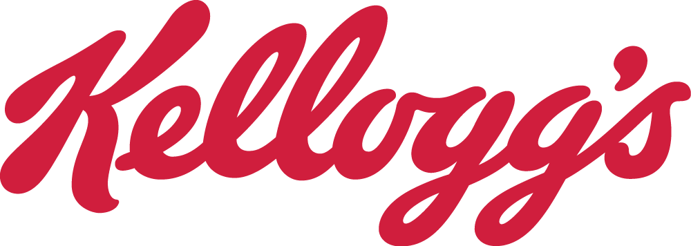
Just look at the logo of the brand “Kelloggs’s”. How clean and beautiful it is!
It is not a difficult task for us to remember when discussed this brand.
Do you know, why is it so? It is because of the regularity of letters, shade and it’s style. The logo is neither too complex to understand nor easily forgettable.
This is why a logo design with excellent fonts is essential.
-
Too much Fanciness can Lead to Misrepresentation
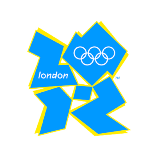
(Source: https://digitalfireflymarketing.com/wp-content/uploads/2016/09/London-Olympics.png)
Now, what do you think what is wrong with this logo?
This logo is of London 2012, which has been designed in such a way to give a ‘Swastik’ shape. But too much of decoration has spoiled the image.
If the creator was trying to explain about the Olympics and related it with London city map then we are sorry to say, this is a failure!
Because of too much use of random shapes of improper size, the Olympics symbol has made the logo look cluttered.
The designer could have mentioned the 5 circles of Olympics with attractive shades. If he/she was about to explain the location London, the creator could have put a map and described it splendidly.
In this content, we have learned to dodge the conception of the fancy logo but how to.. let us deal with it.
...And Then What Could be A Good Alternative to Fancy logo?
As far as we have discovered, now we can say that fancy logos doesn’t impact the reputation of your company.
But in the end, you might get concern about how can we create an effective logo?
The steps are quite manageable.
Get-up-to date with the logo designs.
Don’t get hyper and run behind complex designs.
You need to understand your brand before you start designing a logo.
Keep it flexible, so that when you require to modify it, you can.
Are you planning to use any pictures and text together in your logo? Then kindly take care of pixel quality, font styles, and scalability of both.
By scalability we mean, if your logo needed to printed over business cards, t-shirts, banners..etc. it can come out with the best property
At last, we would conclude that It is better to evade spending long hours and huge expenditure on making a fancy logo.
Author Bio :
Harshal Shah is CEO at Elsner Technologies Pvt. Ltd., Elsner is a leading WordPress development company in the USA. Get WP customization, WP design, Wordpress development & migration service at best price.


Your company brand identity is crucial to your business success.
A good brand logo will represent your company’s mission, values and tell your prospects about your services and products.
Therefore, your business logo must be up to date with modern design trends.
A logo design should emphasize your brand’s strengths and reflect its core values.
A logo must be memorable enough and create a long lasting impact on the minds of your prospects.If your logo is underperforming or if you feel you logo is outdated, then a logo redesign is a great choice.View original post here: https://dubaimonsters.com/blog/best-and-worst-logo-redesigns/

Success comes from the hard work; it is not like you do absolutely nothing or very little work and assume yourself to be entitled as a successful person.
Whereas logo designing is concerned, a logo designer can face their success depending on one perfect logo design, and also face the failure for a lifetime depending on just one single logo design.There are a vast number of qualities that logo designers must possess, as each quality plays its own significant part in making a logo designer a highly successful one.
Following are a few most essential qualities that a logo designer must have in order to be one of the best logo designers.Must Be Able to Think CreativelyRobin Matthew says that,“Design is where science and art break even.”If you want to become a professional and highly successful logo designer, then it is only possible if you have the next level of creativity and you are able to create a design that catches the attention of the customers, as Juan-Carlos Fernandez quieted,“Bad design is smoke while good design is a mirror.”And it is not even remotely possible to develop a good design without possessing a creative mind.
Must Be Capable of Understanding The Persona of The Company or BrandAs David Craib said,“Design should never say, ‘Look at me.’ It should always say, ‘Look at this.’”The logos you develop must reflect the accurate meaning of the brand; it should not let the audience of the brand to stray from the idea it wants to deliver; this can only happen when the logo designer understands the nature of the business altogether.
Must Have The Adequate Knowledge of the Colors PsychologySince every color has its own meaning and delivers its own kind of knowledge, it is necessary for all the logo designers to learn all about the color psychology.
It is mandatory for you to know what each color and its shades mean so that you know which colors to use for every logo design, even though it is from a different industry.


We provide best online logo design services in USA and free web development services at affordable rates.
we have best custom logo designers of USA.
video motion graphics in usa

When you think of New York City, what's the first image that comes to mind? More iconic than yellow cabs or even the Statue of Liberty, the “I love NY” logo is an internationally recognized symbol of the city that never sleeps.
The famous heart-centric logo was created back in the ‘70s and it’s one of the first instances of using a heart in place of the word love. This is a colorful and modern symbol of strength, creativity and unity. It’s a timeless emblem with a rich history, and a powerful message for the future.

Web Design Ind is a highly skilled Graphic Design Company In India and has been in the industry for over a decade.
From web designs and logo designs to illustrations, presentations, and business cards, we offer a comprehensive range of graphic design solutions.
Our team consists of highly experienced and knowledgeable UI/UX designers who aim to create designs tailored to meet all your requirements.


