


For many businesses, landing pages are an afterthought. They’re something you create in a hurry to share with customers who are already interested in whatever it is you’re selling. For that reason, many of the design layouts and objectives are given next to no thought whatsoever.
But if that’s your approach, you may miss out on many sales that you’re not even aware of. A/B testing your current landing page can increase your conversion rates by as much as 300% by implementing even minor changes like new headlines and different images. Optimizing your landing page – if you have one – is one of the most cost-effective business strategies in existence.
A landing page isn’t hard to create. It’s a single page on your website that encompasses an entire customer journey in a concise and clear manner. All of your creative assets work together to drive a single customer action.
How can you create one that works for your business?
Define your goal
Before you sit down to create your first landing page, you need to decide what the objective of the page will be. Are you asking for email signups? Event registrations? Purchase of a trial offer? Your specific conversion objective will dictate how the rest of your page plays out.
It’s imperative that your landing page have a single objective. If you confuse your visitors with multiple offers on the same page, they’ll get frustrated and leave. Placing multiple offers on your page has been shown to actually decrease conversion rates by 266%!
As a side note, that stat doesn’t apply to multiple landing pages. You can (and should) have a separate landing page for each offer to increase the number of leads you receive and help with segmentation.

When you decide what your objective is, it’s a good idea to develop the relevant side assets as well. If you’re going for email signups, you need some kind of lead magnet – an ebook, industry report, or video series all work great.
Decide on design
After you’ve settled on the core conversion objective for your landing page, spend some time analyzing other landing pages in your niche. For instance, if you are creating a page for a SaaS business, it might be worth checking out some SaaS examples from your competitors to get inspiration. Lay out a design aesthetic that works well for your brand and your purpose.
Undoubtedly, this will be the hardest part of the entire process. Unless you have a designer on staff, it might be best to use a template since it will incorporate all the landing page best practices for you.
If you decide to create your own, there are a few areas you’ll really want to focus on. If, however, you decide to use an already designed template, you can use a WordPress theme for small businesses. They usually have all the things in place for you to customize your landing page.
Headline
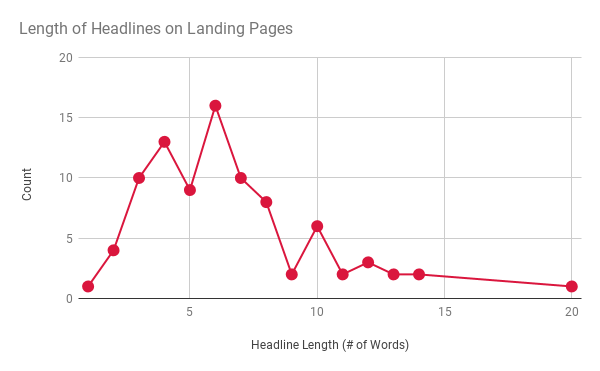
When your visitors come to your landing page, they should know what your offer is within a few seconds. Some experts prefer the “blink test” for this. If a user blinks, how quickly can they identify the message?
Ideally, the shorter the message, the better. Google itself confirmed that users only need half a second to form an initial impression about a web page. The faster you can convey your message, the better your chance of capturing a conversion. That means putting target keywords toward the front of your headline, including action words, and using bold type font.
Layout
You want to think of the layout as a sort of sherpa for your audience, guiding them down the page to the eventual goal.
For that reason, there are a few key principles to keep in mind:
- Embrace negative (white) space. It keeps the eyes moving to the copy, which is where you’ll state your case. It also keeps the page from looking cluttered.
- Use video wherever it makes sense. Studies have shown that relevant, embedded video can increase conversion rates by 86%.
- Consider utilizing relevant, informative, infographics and attractive illustrations
- Insert a lead form above the fold, along with a few other spots. Be judicious, but give the visitor more than one opportunity to take action.
- Make it scannable. Eyes tend to move in an F-patten down the page, so use bullet points, short headlines, and left-justified text to keep customers’ attention focused where you want it.
Assets
If the headline captures initial attention and the layout organizes your material, your creative digital assets are what drives the sale. This includes the images you’ll use to help your customers visualize the product and the copy that entices them to take action.
The same applies to your sales copy. It should be clear and concise, relaying one important bit of information at a time. Discuss the transformation your audience will expect when they complete the conversion objective.
One type of content that works extremely well on a landing page is user-generated content. Testimonials and customer images do more than tell your customer what to expect; they show it in action. Use as many high-quality pieces as you can get, and sprinkle them throughout the landing page in strategic areas. Testimonials are included in about 37% of the top landing pages.

Make sure after collecting customer reviews that you’ll showcase them on your landing page like MannequinMall is doing.

Optimize for search
Since landing pages exist online, they’re indexable by Google and other search engines. This means they will get intentional traffic from places you are actively driving, like ads and affiliate offers, and organic traffic that comes straight from search engine results pages.
To optimize the SEO for your landing page, include as many target and secondary keywords as you can. These should all be highly targeted as well; you still want the traffic to be somewhat qualified, after all. Create a meta description for your page that includes a few keywords, and optimize the page for mobile.
With any luck, your landing page will be ranked in global and local search results, giving you added visibility with a bonus of a landing page conversion objective.
Describe your value
No landing page is complete without trying to close the sale (whatever your specific conversion event actually is). Your call-to-action (CTA) needs to be visible not just once but multiple times – ideally, right next to your opt-in form. Use contrasting colors with your button to make it stand out just a little more.
Trying to nail down your CTA can be tricky. You want to use a word that prompts some kind of action — download,” “submit,” or “get access now” are some of the most popular ones – but it also needs to be short. The less time you give people to consider whether they want to back out on your conversion event, the better.

Ultimately, your CTA should evoke trust; anything that can reinforce that your product or service is a good buy for your customers should be included. Reiterate the benefits, provide solutions to their pain points, and talk about all the other people who have already taken action. There’s strength in numbers; you might as well use it.
Last but not least, make any discounts, trial offers, or bonuses visible next to your CTA as well. That might just be the one bit that pushes them over the edge into action.
Set up a confirmation page
A “thank-you” page is usually one of the most overlooked parts of this process, but it’s an important step to retaining the customers’ goodwill. Usually appearing after the conversion event has taken place, a confirmation page tells them what they can expect next, whether that’s an email, phone call, or delivery of the product or service.
Take the opportunity to show your gratitude — and if possible, include an upsell. You don’t need to be as blunt about any upsells as you were on the original landing page, just an awareness of other opportunities that they may want to take advantage of.
Your confirmation page also offers you an additional source of marketing. Include your social media icons on the thank-you page to encourage people to share the offer with others in their network. With any luck, you’ll drive more sales or signups, in addition to your paid and organic traffic.
Conclusion
Given how effective landing pages can be at both driving traffic and closing leads, there’s no reason for your small business not to employ them regularly. Landing pages are not just reserved for major companies who invest a lot of time and resources into their website. They’re for anyone who wants to set themselves above the competition and create an easier selling process.
Try a few for your business, and you’ll be surprised at how effective they are.


Boosting B2B lead generation has always been a great challenge for top companies like The Global Associates; convincing complete strangers about the suitability of your product or service is never easy.
The business scenario has undergone a metamorphosis over the years, ever-intensifying global competition and super-busy decision-makers make B2B lead generation even tougher and more challenging now.
One needs some really innovative ideas that could boost sales and help them grow.
Keep your registration forms short and simple; make your Call to Action very conspicuous.
Hiding it in an obscure corner or at the bottom of the page won’t work.
Optimum use of social media

When we start an online business, we need some potential clients to communicate with. Mainly the big questions entrepreneurs constantly ask is " how to expand my business without chasing my relatives and friends?" " how to generate more leads online ?" For that we need a lead capture page. A lead capture page or a landing page is the link that a visitor is directed to when clicked on an advertisement. It is extremely important as it is the page where your traffic is converted into inquiries or even sales.
Here is everything you need to know about the top 10 tips to get better conversions through Lead capture page


