


Research shows that Google has a whopping 76% market share of all search engines. Google algorithm changes are a part of the ongoing process of fine-tuning a website.
Google's routine of re-evaluating and updating its algorithms in light of recent behavior and anticipated future trends is nothing new. Their mission from the beginning has been to showcase the finest of every given website and provide a stage from which they may get more traffic and more exposure.
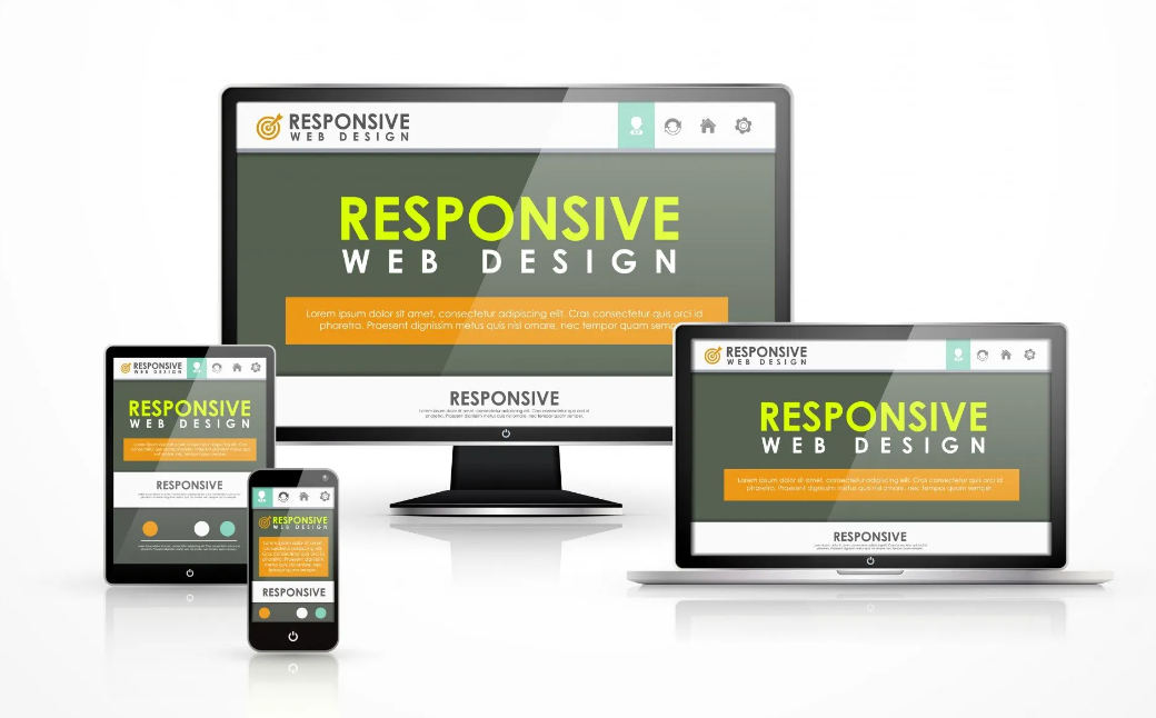
Several Excellent Benefits of Responsive Website Design
First, you won't have to pinch, zoom, or resize anything ever again
When using your phone to access a website, have you ever encountered any really annoying moments? I have. This occurs most often when I am a passenger in a vehicle and need to look up information, such as a business's hours of operation, a restaurant's menu, or a contact's location or phone number. Usually, I have to quickly locate a certain bit of data.
Pinching. Zooming. The pictures won't load. It's too small to read the text. Tiny buttons that are too little for my finger.
The situation is terrible. It's frustrating. If I can't figure out anything on a website, I pray to the Google gods that they'll help me discover the solution so I don't have to.
It Looks Awesome
Not only are things straightforward to locate, but also, and this is especially important for visual content, the photos you get are presented in their highest quality possible. When you change the width of your browser, the pictures will resize and the content containers will be rearranged so that you can see and interact with everything. If you reduce the size of your browser window, you won't lose any information.
Reducing the Rate of Bounce-Back
This is related to the now-outdated "shrink and scroll" user interface. Inaccessible on a mobile device, visitors quickly quit these sites. This is simplified and made more user-friendly using responsive site design.
Besides these benefits, responsive web design also has others.
With responsive design, a single content source and URL may serve a wide range of screen sizes, from mobile phones and tablets to laptops and desktop computers to even large-screen televisions. HTML5 and CSS3's support for media queries is essential to responsive design. In order for a website to function properly, it must adapt to whatever screen resolution the user is using. Different media queries are established for smaller and bigger screen sizes.
Intriguing Stuff That Happens Behind the Scenes
Unless visitors experiment with different screen resolutions, they won't realize the site is responsive. That's encouraging since it implies that it achieves its goals without being overbearing. It's so simple but so effective.
Developers (and you) benefit since you won't need to create a separate piece of code to support numerous devices.
Bootstrap is the framework we've been utilizing as a web design company in Mumbai to build our web pages on. It's the foundation for building websites' front ends. Sam insists that it is the best tool available and that everyone should be utilizing it. Our customers use Freedom to manage the content on their websites, and we plan to keep using it.
Every future site we create will follow our own advice and be mobile-friendly. Adding such features does add much more time to the design and development process. Yes, this design method requires much preparation time to be spent on things like content hierarchy, data analysis, and long-term strategy. Although this is a significant investment, we are certain that responsive design is an important and sustainable technology.


While searching for a Web Design Company In Mumbai, I came across this website that offers the best website designs.
I have never seen such unique website designs that they offer.
You can have a look at their website if you are also searching for the same.