


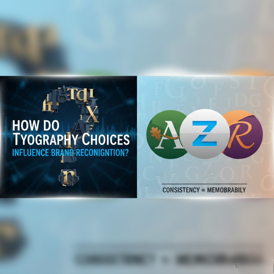
Typography is not just about making words readable. It is about shaping how a brand is remembered. Long before people consciously analyze a logo or understand a brand’s message, they feel its typography. Fonts silently communicate personality, trust, emotion, and identity. Over time, they become mental shortcuts that help people recognize and recall a brand instantly. In many cases, typography becomes so closely associated with a brand that even a few letters in that style are enough to trigger recognition.
Brand recognition is built on repetition and emotional memory. Typography plays a huge role in both.
Typography creates a visual voice for the brand. Just like people recognize voices without seeing faces, audiences learn to recognize brands through their typographic tone. A brand that uses strong, bold typography consistently feels confident and authoritative. A brand that uses soft, rounded typography feels friendly and approachable. A brand that uses elegant serif fonts feels premium and traditional. Over time, this visual tone becomes part of the brand’s personality. People don’t just recognize the logo, they recognize the style of communication.
This is why typography is often more powerful than imagery in building long-term brand memory.
Typography strengthens visual consistency, which is essential for recognition. When a brand uses the same fonts across all touchpoints, such as websites, social media, packaging, advertisements, and emails, it creates visual stability. The audience begins to associate that specific typographic style with the brand’s presence.
Consistency trains the brain. The more often people see the same typographic patterns, the faster their brain connects them to the brand. That is how recognition becomes automatic rather than conscious.
Typography directly influences emotional recall. Humans remember emotions better than visuals. Typography carries emotion.
A sharp, geometric typeface feels modern and technological.
A handwritten font feels personal and creative.
A tall, thin serif font feels luxurious and exclusive.
A rounded sans-serif feels safe and friendly.
When people emotionally respond to typography, they remember the brand through feeling rather than logic. This emotional memory is far stronger than visual memory alone.
Typography improves logo recall even without symbols. Some brands are recognized purely by their wordmark typography. Their font becomes their identity. Even if the logo icon is removed, the brand is still recognizable because the letters themselves carry identity.
This is why custom typography is so powerful. It creates exclusivity. No other brand can look or feel the same.
Typography builds trust and professionalism. Recognition is not only about being remembered, it is also about being believed. Poor typography choices reduce credibility. Random fonts, inconsistent spacing, or unbalanced type make a brand feel careless.
When typography is clean, structured, and intentional, it builds confidence. People trust what looks well-designed. Trust strengthens recognition because people remember brands that feel reliable.
Typography helps differentiate brands in crowded markets. Many brands use similar colors and imagery. Typography becomes the differentiator. Two brands may use blue, but their fonts will never feel the same if designed thoughtfully.
This difference allows audiences to separate brands visually and emotionally. Distinction leads to stronger recognition.
Typography supports memory through simplicity. Simple type systems are easier to remember than complex ones. When a brand uses too many fonts, styles, or decorative elements, memory becomes fragmented.
Strong brand typography usually uses:
One primary font
One supporting font
Clear hierarchy
This clarity makes the brand easier to recognize and recall.
Typography adapts brand identity across platforms. In 2026, brands live everywhere: mobile apps, websites, social media, motion graphics, AR experiences, and print. Typography must work in all environments.
When a brand’s typography is flexible and responsive, recognition stays strong regardless of where the audience encounters it.
Typography creates subconscious familiarity. Most people cannot name the font a brand uses, but they recognize it emotionally. That is the power of good typography. It works without being noticed.
When typography becomes invisible yet familiar, recognition is at its strongest.
Typography reflects brand maturity. Brands that invest in thoughtful typography show seriousness and long-term thinking. This creates respect. Respect strengthens memory and loyalty.
Typography is often the difference between a brand that looks temporary and one that looks established.
Typography influences how fast recognition happens. The faster a brand is recognized, the stronger its identity. Clear, distinctive typography speeds up this process.
In digital environments where attention spans are short, this speed matters.
Typography connects design to psychology. Recognition is psychological. The brain stores shapes, patterns, and emotional associations. Typography works directly with this system. It builds memory through structure, emotion, and repetition.
Conclusion
Typography choices influence brand recognition by shaping emotion, consistency, memory, trust, and distinction. They turn written language into visual identity. When used strategically, typography becomes more than design; it becomes a brand signature. People do not just remember what a brand says. They remember how it looks when it speaks.
Strong typography transforms brands from being seen to being recognized.
This depth of understanding is developed in professional creative environments like Equinoxx Creative Academy, where students learn typography as a branding psychology tool rather than just a design element. For anyone serious about building powerful visual identities and mastering brand communication, choosing a graphic design institute in Ahmedabad becomes the foundation for designing typography that is not only beautiful, but unforgettable.


Most likely you are here in this article looking for Logo Design Singapore and is quick to realize what are the accessible choices in logo design and searching for a reasonable Logo Designer Singapore.I have numerous customers moving toward me with similar inquiries.
These logos promptly interface with their business without seeing the names.A logo is significant for each business be it any size since it uncovers your character.
A very much planned logo imparts your clients what your identity is, your main event and so onPotential clients may mean to work with you and trusts in the event that you have an expertly decent logo designed.A logo represents your business, however do you realize that there are various kinds of logo design.
In any case, how simple is it for a business to pick a decent logo, very much how about we perceive how.LettermarkA lettermark logo is made of text, however dependent on the initials of the organization or brand.
Since the lettermark logo centers around intials, the textual style your independent logo fashioner utilizations to pass on your image ought to be founded on your organization subject, and furthermore it should glance more decipherable in namecard and the organization sheets where you print.WordmarksWordmark logo design is very much similar to lettermark logo designs, except that it focuses on the company’s full name.
Wordmark logo works well for businesses who has unique names like Coca-Cola, Google.