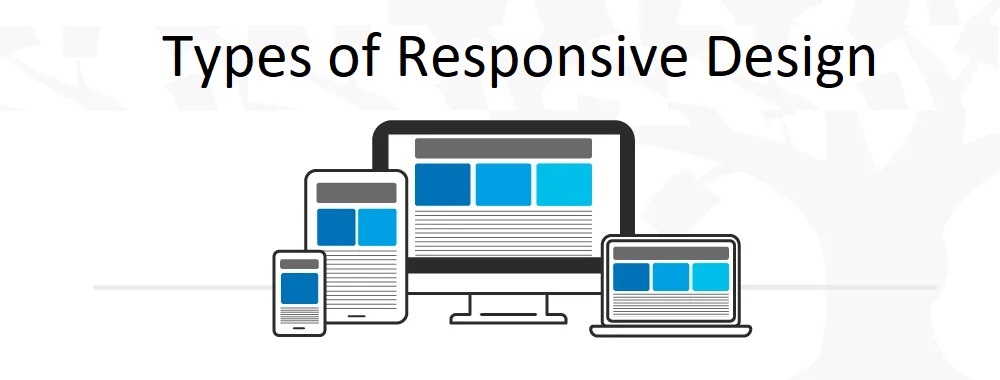



The growth of the mobile segment is a trend of the last five years. That's why having a mobile-friendly website is a must.
A mobile-friendly website allows you to determine the type of user device. If the device responds as a mobile one, the site code interprets this and loads adapting to the screen with the appropriate resolution.
This allows users to easily flip through pages without unnecessary zooming or pressing tiny buttons and links. If there are no such facilities, then it is very likely that the user will quickly leave the site.
Consider the following 5 “to-do’s” for successful mobile optimization:
- Responsive design
Responsive layout is the adaptation of the site to the mobile device used by a customer. Google primarily recommends focusing on adapting the site to smartphones.
Responsive design eliminates the need to create a separate domain for the mobile version since one address is used. When performed correctly, the website is displayed perfectly on different screens. The functionality is preserved, but pages may take longer to load due to heavyweight elements (scripts, volumetric images, gifs, filters, calculators).
- Fast website load times
When it comes to mobile shopping, page speed is essential. Even a 1 sec delay in page load time reduces page views by 11%.
To optimize the site for the best performance on mobile devices, it is important, if necessary, to change the hosting provider, minify the code, limit the amount and size of uploaded content, and also clean up the main page as much as possible, getting rid of all unnecessary things. Thus, you will be able to achieve a significantly higher page loading speed.
Find out 3 more tips to make your website mobile-friendly here: https://neklo.com/m-commerce-and-magento-mobile-app-development/