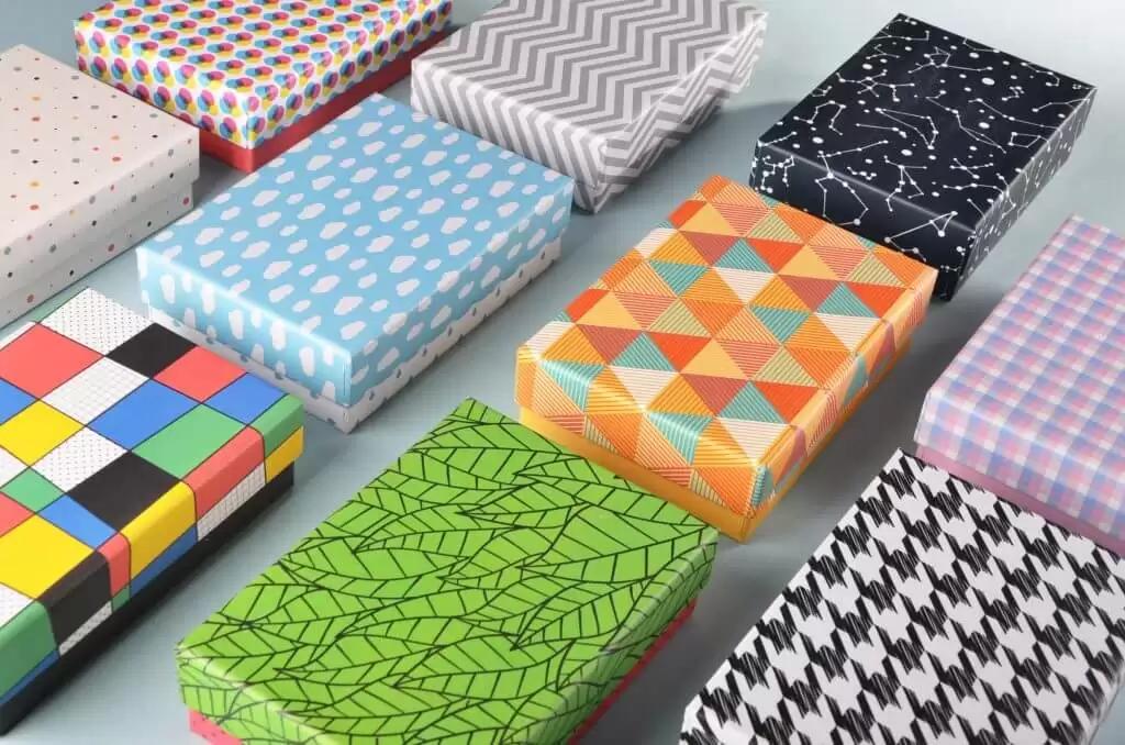


When printing the paper box, you may sometimes find that the effect of the paper box printing is not very good, and there are many small details that have not been handled well, which eventually leads to the final appearance of the overall effect is not good. At this time, you may find that there are many small details that have not been dealt with well, and ultimately the whole process is wasted. Therefore, you should pay more attention to some small details before paper box printing, so that the overall effect will give people a bright feeling, and there will be no messy feeling.
The following bookprintingchina will discuss with you the matters that must be paid attention to in the design of small text and lines, and I hope it will be of some help to everyone.
(1) Small text and lines should be designed into a single package to avoid inaccurate multi-color overprinting. The width of thin lines should not be less than 0.1mm. If it is higher than 0.1mm, it is easy to lose or unclear strokes in printing. The net height of Chinese fonts shall not be less than 1.8mm, and the net height of English fonts shall not be less than 1.5mm.
(2) Special attention should be paid to the design of anti-white text. If the text is small, especially when the strokes are thin, monochrome should be used. You also need to pay attention to the selection of fonts. Round head, black, and isoline are relatively suitable choices, while fonts such as Song style and old Song style (horizontal, thin, vertical, and thick) are too different. You need to pay attention. These fonts need to be used with caution. If this type of font is used in the design, it should be noted that the net height of Chinese fonts should not be less than 2.5mm, and the net height of English fonts should not be less than 2mm.
There are some undesirable phenomena in the overprinting of paper box printing, that is, the ink printed later cannot smoothly adhere to the ink printed first during wet-to-wet overprinting.
About the reason for it:
(1) The viscosity of the ink printed later is too high compared with the ink printed first.
(2) The first printed ink is slow to fix and has a large amount of ink.
(3) The color intensity balance of the four-color ink is not appropriate.
Approach:
(1) Use high-viscosity ink to print first, and low-viscosity ink to print later. The ideal viscosity requirement should be gradually reduced in the order of overprinting colors.
(2) Use fast-fixing ink to print, and the concentration is high and the printing is thinner, and the pattern area is small to print first to facilitate later overprinting.
(3) The color intensity of any set of wet multi-color overprinting inks is balanced, and the same amount of ink can be used for overprinting.


