


Most apps lose 80% of new users within the first 90 days.
More than half of all users who uninstall your app will do so within the first four to five days — the typical onboarding period.
Poor UX is the top reason why users abandon your app.
Your mobile app navigation should avoid these 5 major UX design mistakes. 🚀
Mobile App Navigation: 5 Major UX Design Mistakes 😟
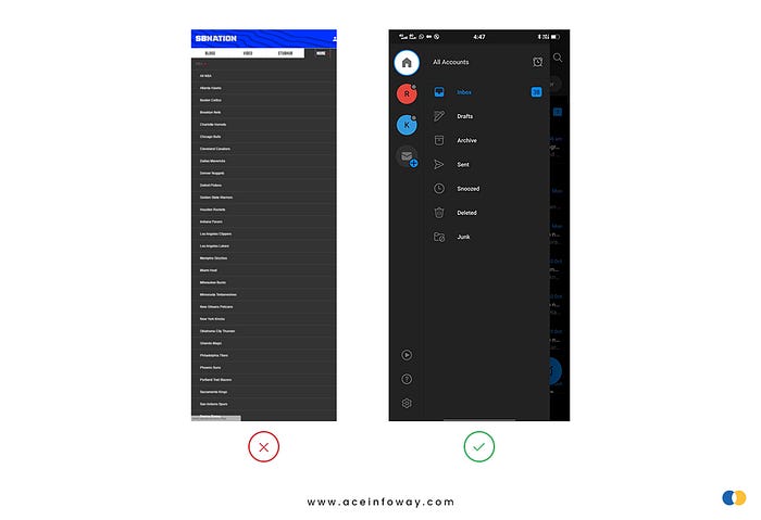
5/5 — Your Navigation Menu Has Too Many Options
The primary mobile navigation menu of the app can be accessed via the navigation menu. Therefore, if the opportunities in the primary navigation menu are too many, users can get confused and quit the app without taking any action.
Take an example of a restaurant menu, if you have so many dish options you get confused & overwhelmed and it is often hard to decide on the best dish. It’s the same with apps. Users will just leave an app if it has an extensive list of items that they find difficult to quickly comprehend.
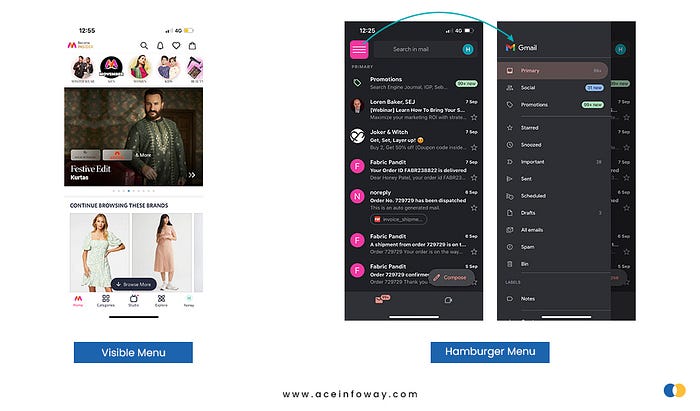
4/5 — Hidden Navigation Menu
Hidden navigation menu like a hamburger menu has hoover through navigation components in an app like a hurricane. No trend, though, is without its critics.
Out of sight, out of mind is the fundamental root of the problem with hidden menus. Users are less likely to tap on a menu when they can’t see it. Using a hidden navigation menu to discover what you want requires more cognitive work.
Users don’t use their mobile phones in a perfectly focused way, like a usability test. They often have several things on their minds at once, so if your navigation isn’t visible, then it might drive potential users away.
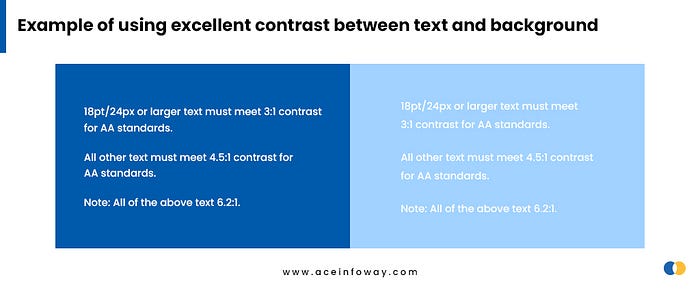
3/5 — Using The Wrong Colors
Around 300 million individuals worldwide are believed to have a color vision deficiency. 1 in 12 men and 1 in 200 women are color blind. Therefore, the majority of designers don’t face color blindness issues, so it’s easy to forget that we’re developing for this specific user group too.
While using light fonts on light backgrounds in the mobile navigation menu may look elegant but in this type of color contrast, the content/menu is unreadable. Additionally, using light fonts in small body text may cause usability issues. Users are likely to uninstall your app if it has a visually appealing UI but is challenging to understand.
Continue reading to avoid TWO more mistakes — https://bit.ly/3TXOaWW


