


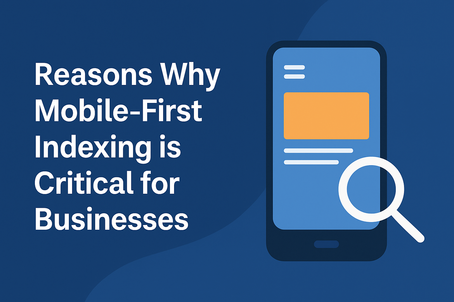
Introduction
The shift to mobile-first indexing has changed how businesses need to think about their websites. Google now prioritizes the mobile version of a site when ranking search results, which means a polished desktop design isn’t enough anymore. To succeed, businesses must create mobile experiences that are fast, user-friendly, and complete. Thirteen industry leaders shared why mobile-first indexing matters and how companies can adapt.
Mobile Traffic Dominates Banking Sites, Demands Optimization
Most people don't realise that over 85% of traffic for financial services sites like ours at BankingTimes comes from mobile. So when Google moved to mobile-first indexing, it wasn't a suggestion, it became the default lens for ranking. If your mobile site loads slowly, strips out key content, or buries info in expandable sections, Google basically sees an incomplete version of your site. I've seen pages drop out of the top 3 rankings just because the mobile layout didn't carry the full article or used lazy-loaded images that never showed.
I always tell business owners to stop reviewing their sites on a 27-inch monitor and start checking them on a five-year-old Android phone with 3G. That's closer to what your users deal with. Don't rely on developer previews either. Open your phone, try to read a blog post, click a button, or fill out a form. If it annoys you, it's probably costing you rankings.
Bert Hofhuis, Founder & Entrepreneur, BankingTimes
-------------------------------------------
Google Ranks Mobile Sites First, Desktop Second
Mobile-first indexing matters because the majority of people now browse on their phones, and Google prioritizes what those mobile users see. When Google switched to mobile-first indexing, it meant their algorithms look at your site's mobile version to decide how to rank you, not the desktop version. So if your mobile site is slow, clunky, or missing content, your rankings will suffer.
I remember working with a client whose site looked great on desktop but was a mess on mobile. Navigation was confusing, images didn't scale properly, and some key info was buried. Once we revamped their mobile experience, streamlined the layout, and improved load times, their rankings started climbing within a couple of months. Traffic from organic search on mobile devices went up noticeably, and their engagement metrics improved too.
Making a site mobile-friendly isn't about cramming everything onto a smaller screen. It means designing for how people actually use their phones, quick taps, clear menus, easy-to-read text, and fast loading. Testing across multiple devices and using tools like Google's Mobile-Friendly Test can highlight issues that need fixing. In my experience, investing time in mobile usability translates directly into better visibility and more satisfied visitors. If your mobile site feels like an afterthought, Google will treat it that way.
Paul DeMott, Chief Technology Officer, Helium SEO
-------------------------------------------
Mobile Experience Now Defines All Search Rankings
Mobile-first indexing is important because Google now uses the mobile version of your site as the baseline for ranking and indexing. That means your mobile performance defines how your site performs in search across all devices. If your mobile experience is weak, your rankings suffer no matter how polished the desktop version looks.
This is why we took a close look at how pop-ups were affecting the mobile experience and made intentional changes to meet Google's mobile usability standards. We removed anything that interrupted navigation, blocked key content, or made users wait before accessing the page. The few pop-ups we kept, such as product alerts and email signups, were adjusted to appear only after the user had time to engage with the content. We tested their timing, placement, and ease of dismissal to make sure they felt natural and didn't create friction.
Dr. Chad Walding, Chief Culture Officer and Co-Founder, NativePath
-------------------------------------------
Mobile Design Creates Competitive Edge in Search
Mobile traffic continues to grow year after year—and it's not slowing down.
Optimizing for mobile isn't just an SEO play; it's how you stay visible and relevant as more users rely on their phones to browse, compare, and buy.
While many businesses still overlook the mobile experience, that gap is your opportunity. Google prioritizes the mobile version of your site when ranking you—so if your pages load quickly and offer the full experience on mobile, you're already ahead of competitors clinging to outdated desktop-first setups.
Treat mobile as your main touchpoint, not a scaled-down version of desktop. Focus on getting users to key actions fast—simplify your menus, highlight important links early, and use clear sections. Break up long content into expandable parts that users can tap to open when needed—this keeps the page clean and easier to scroll.
Adjust layouts so buttons, text, and images shift naturally to fit smaller screens. Speed things up by loading scripts only when needed and making sure your site stores basic files for faster repeat visits. Use tools like Chrome's mobile view and real user session recordings to spot where people get stuck. What works on desktop might fall apart on a phone—so design with the mobile journey first.
John Pennypacker, VP of Marketing & Sales, Deep Cognition
-------------------------------------------
Responsive Design Boosts Mobile Rankings and Conversions
Mobile-first indexing is key because search engines now prioritize the mobile version of a site when ranking over the desktop version. Most users are now accessing websites on mobile devices so a site that is not fully optimized for mobile can quickly lose visibility in search results.
Focus on responsive design to make it more mobile-friendly. This allows your site to adapt to different screen sizes to make it easier to navigate on any device. I recently helped a transportation client redesign their site. We improved mobile load times and simplified its navigation. This has led to a big boost in mobile inquiries and higher conversion rates. A good mobile experience is not always about shrinking content but more about speed and making things easy to use. Regular testing and optimization are essential to staying competitive in today's market.
Gerti Mema, Marketing Manager, Equipment Finance Canada
-------------------------------------------
Simple Mobile Content Keeps Search Rankings Strong
Mobile-first indexing matters because Google now looks at your site's mobile version first when determining how to rank it. More and more people browsing on their phones so it only makes sense that Google would prioritize the mobile experience. You could end up losing visibility which can hurt your business if your site is not optimized for mobile.
We make sure that the content we produce is easy to read and navigate on mobile. We focus on keeping things simple by breaking up content into small and digestible chunks. We use clear headers and make sure the text is easy to read on a smaller screen. This helps clients not only meet mobile-first indexing standards but also improve user experience to keep visitors engaged longer and help rankings stay strong.
Adam Yong, SEO Consultant & Founder, Agility Writer
-------------------------------------------
Poor Mobile Sites Cost Campaigns Crucial Visibility
Mobile-first indexing is essential because it shifts the spotlight onto how people access information on the go, especially with the rise of smartphones in everyday life. Google prioritizing mobile content means that a site's desktop version won't carry as much weight unless its mobile counterpart is equally solid. That's important for businesses aiming to reach audiences who expect quick access to news, products, or services anytime, anywhere.
Keeping a site mobile-friendly goes beyond responsive design. Sites must load swiftly, avoid intrusive pop-ups, and ensure content appears clean and readable on small screens. In a political campaign I followed closely, several candidates lost traction online due to poor mobile experiences. Their sites were slow and hard to navigate, which turned off mobile visitors at crucial moments. This made it clear that mobile-first indexing isn't a tech detail; it shapes how well businesses connect with people in a fast-moving world.
Elizabeth Lawrence, Managing Editor, MAGA.com
-------------------------------------------
Build From Phone Up, Not Desktop Down
Most developers still build websites for desktops. They design them for desktops and then shrink them down to "fit" mobile. But if 80% of your traffic is on phones (which it is), that logic is backwards, and we've lived the pain of it.
For years, we built on WordPress. It's flexible but also clunky, slow, and stitched together from different parts: hosting from one company, theme from another, and plugins from five different teams. Anytime something updates, something breaks. And your customers don't care about your plugin stack; they just want it to load, work, and book a job.
Worse, the mobile experience is often terrible.
Buttons too small
CTAs buried
Slow loads
Layouts collapsing
Fixing it means involving three people: the designer, the developer, and the plugin support desk.
That's why we've shifted our entire system to mobile-first, unified platforms like Webflow, but for business owners, even Wix or Squarespace are often smarter choices than legacy WordPress builds.
Grace Savage, Brand & AI Specialist, TradieAgency.com
-------------------------------------------
Mobile-Friendly Sites Prevent Digital Extinction Risk
Mobile-first indexing is the method by which Google now bases its entire algorithm, so it's a vital component of any business's online strategy. To put it simply, you MUST have a mobile-friendly site or you risk having your presence wiped off the internet. So, how can that be accomplished? In this day and age, it's not as hard as you might think. You need to have a site that is responsive to every type of browser and mobile device, meaning it can adapt to any-sized screen (most themes in WordPress, for instance, can already do this). Secondly - and this is the more difficult piece - you need to make sure your site loads as fast as possible, so try not to bog it down with anything other than what is truly necessary. Again, speaking of WordPress, don't rely on dozens of plugins to keep your site running, as that will ultimately slow it down and could hurt your mobile-first rankings. These are just a few ways to stay ahead of the competition in a mobile-first world, and it really isn't as hard to do as you might think when you work with a solid developer.
Phil Eisenloeffel, Vice President, Valco/Valley Tool & Die, Inc.
-------------------------------------------
Mobile Experience Becomes Foundation for Search Success
Mobile-first indexing is important because Google now uses the mobile version of your website as the main version it checks when deciding how to rank your content. That means your mobile experience is no longer a side consideration. It's the foundation. If your site looks great on desktop but loads slowly, breaks layout or hides content on mobile, you are going to lose ground in rankings without even realizing it. And with most users coming from mobile devices, this directly affects traffic, engagement & revenue.
So, what you need to consider to comply is how your site performs on actual phones, not just in a preview. Your layout should adjust cleanly across screen sizes, with readable text, easy-to-tap navigation and no elements getting cut off or overlapping. Speed matters too, so compress images, reduce unnecessary scripts and avoid anything that slows the load time. Then make sure buttons are spaced properly, pop-ups are not blocking content and the entire experience is smooth from first click to scroll. Use tools like Google Search Console and PageSpeed Insights, but back it up with real testing on different devices. If mobile users can move through your site without frustration, you're giving Google and your visitors exactly what they need.
Khris Steven, Content marketer, SEO and Automation expert / Founder, KhrisDigital Marketing
-------------------------------------------
Mobile Optimization Increased Client Traffic 40%
Mobile-first indexing is like putting your best foot forward, if you don't prioritize mobile, you risk losing your audience. At Ventnor Web Agency, we emphasize that Google now uses the mobile version of your site for ranking, making it essential for businesses to ensure their sites are mobile-friendly.
To achieve this, focus on responsive design that adapts seamlessly to different screen sizes. For example, we helped an accounting client increase mobile traffic by 40+% by optimizing their site for mobile users. Regularly test your site with tools like Google's Mobile-Friendly Test to identify areas for improvement. By prioritizing mobile usability, businesses can enhance user experience and boost their search visibility.
Marko Rojnica, Founder & CEO, Ventnor Web Agency
-------------------------------------------
Test Your Site Like Users Do: Mobile
"Mobile-first matters because it reflects how people actually interact with websites today. Think about your own habits—you're likely researching, browsing, or even buying on your phone throughout the day. Your customers are doing the same. That's why at Loopex, we treat the mobile version of a site as equal to the web version, not a secondary or simplified one.
When clients come to us with ranking drops or low conversion rates, one of the first things we check is the mobile experience. We go beyond just seeing if it "looks okay" on a phone—we evaluate if the content is complete, the navigation makes sense for a thumb, and the load speed doesn't kill engagement. Too often, we've seen mobile versions missing schema markup, burying key calls-to-action, or loading way slower than desktop. These things don't just hurt UX—they impact your visibility in search.
We advise clients to scroll their own site like a user: is the core message obvious? Is it easy to take action? Does it load fast enough before someone bounces? You don't need a lab to answer those questions—just honest testing on real devices. If your site doesn't perform where your users live, Google—and your customers—will move on."
Maria Harutyunyan, Co-Founder, Loopex Digital
-------------------------------------------
Learn From Mobile Success Stories, Skip Errors
Website performance on smaller screens is becoming the main focus of mobile-first indexing, and brands that embraced this shift early are already seeing the payoff. Case studies from companies that nailed the transition offer more than inspiration; they provide a roadmap.
Whether it's a retailer streamlining mobile checkout or a news outlet optimizing load speed and readability, these examples show that success isn't about guesswork—it's about intentional design decisions backed by data.
Businesses that study these wins can skip the trial-and-error stage and implement proven tactics that meet both user expectations and search engine priorities. It's smart to learn from your own experience, but even smarter to learn from others who've already figured it out.
Grant Aldrich, CEO, Preppy
Conclusion
Mobile-first indexing isn’t optional—it’s the standard Google uses to decide how websites rank. A weak mobile experience can erase visibility, traffic, and revenue, even if the desktop site looks perfect. The experts agree: build for mobile first, test on real devices, and streamline speed and usability. Businesses that embrace this shift will protect their rankings, stay competitive, and connect more effectively with their customers.


