


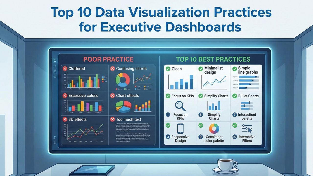
Executive dashboards should simplify decision making, not overwhelm leaders with cluttered charts or confusing metrics. When designed well, they highlight trends, risks, and opportunities at a glance. When designed poorly, they create misinterpretation, slow down action, and bury key insights under unnecessary detail.
The following ten practices help create clear, reliable, and meaningful executive dashboards that support confident decision making.
1. Focus on the Metrics That Truly Matter
Executives don’t need every metric. They need the ones tied to strategy, growth, and ongoing performance. Before designing a dashboard, identify the core indicators that influence major decisions such as revenue, pipeline health, customer retention, product usage, or financial stability. A concise set of metrics always creates sharper insights.
2. Use Clear and Consistent Visual Formats
Consistency makes dashboards easier to read. Use the same chart types for similar metrics so the viewer doesn’t have to re-learn each visualization. For example, always use line charts for trends, bar charts for comparisons, and gauges only when necessary. Consistent formatting builds familiarity and reduces cognitive load.
3. Keep the Design Simple and Avoid Visual Noise
Executives often review dashboards under tight time constraints. Removing unnecessary colors, labels, and decorative elements helps them focus only on what matters. Clean spacing, readable fonts, and uncluttered charts improve digestion of information within seconds, not minutes.
4. Use Color Purposefully
Color should guide the viewer’s attention, not distract them. Use it to highlight key insights, such as revenue gaps, milestones, or risk indicators. Avoid bright or excessive palettes. Choose a neutral base and introduce color sparingly to emphasize what leaders must notice immediately.
5. Tell a Clear Story Through the Layout
The sequence of information matters. Start with high level metrics, move to trends, then offer supporting details. This top down structure helps executives understand the big picture first before diving deeper. A logical layout improves how quickly insights translate into action.
6. Highlight Trends Rather Than Static Numbers
Executives care less about a single data point and more about direction. Display month over month or quarter over quarter trends to show movement. Whether revenue is rising or customer churn is creeping up, trends reveal momentum that static values simply can’t capture.
7. Keep Data Fresh and Automatically Updated
Dashboards lose their value if updates depend on manual processes. Automated data refreshes ensure that leaders always view accurate, real time information. This helps executives trust the dashboard as a reliable source for daily or weekly decisions.
8. Provide Context for Every Metric
A number without context creates uncertainty. Use targets, benchmarks, or historical averages to help executives quickly understand whether a metric is strong, weak, or off track. Context adds meaning and drives more confident actions.
9. Make It Easy to Drill Down When Needed
Executives need high level insights, but they also need the option to explore details when something looks concerning. Dashboards that allow drill downs into product segments, regions, or customer categories provide flexibility without overwhelming the main view.
10. Maintain Consistent Data Definitions Across Teams
A dashboard is only as reliable as the data behind it. Ensure every term, metric, and calculation follows the same definition across departments. Alignment prevents confusion and builds shared trust in the dashboard’s insights.
Conclusion
Executive dashboards succeed when they deliver clarity, highlight what matters most, and support quick decision making. By focusing on clean visuals, meaningful metrics, and consistent design, organizations can create dashboards that leaders rely on every day. These practices help turn raw data into a powerful strategic tool that drives action and keeps teams aligned with business goals.
Check out OzaIntel's Data Visualization Services from the mentioned link.


